 We take now, a (spoiler free) moment to remember Mad Men, which had its series finale last night. Though set in the world of advertising, it wasn’t about ads. It was about the evolution of the characters and the world in which they lived.
In much the same way, it’s facile to think that “design” is simply about making things look good. Good design, too, is a way of understanding and interacting with our rapidly evolving world. Design has grown in importance over the years to become a key component to the success of any product.
The challenge is that there are so many products to design for: phones, tablets, desktops, even how a product looks on a watch must now be considered. This proliferation of devices has spawned a new way of thinking about design — a device-agnostic approach to designing products.
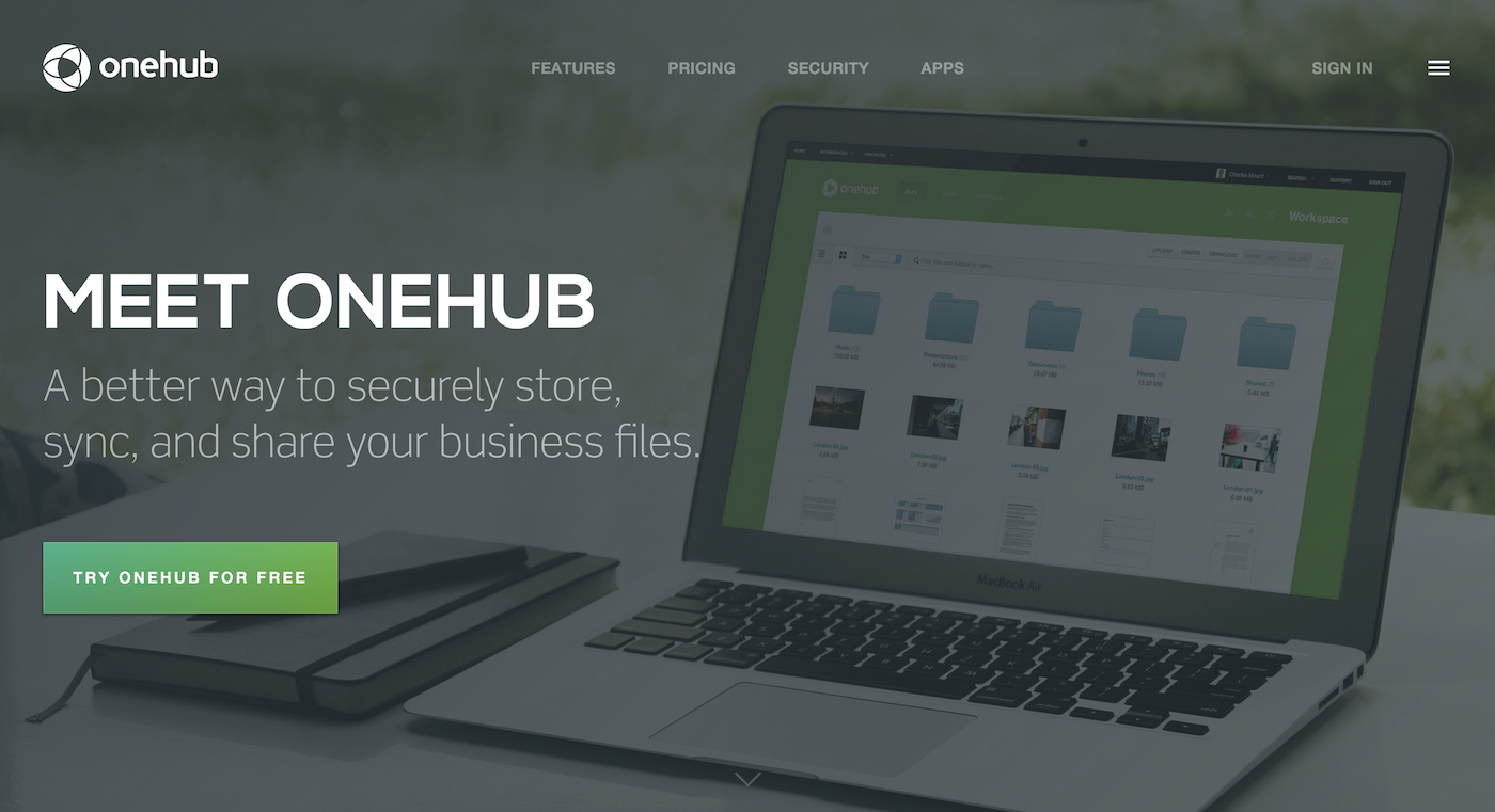
And — here is a spoiler — we’ve been putting these principles to good use as we re-design our own site. You can get a sneak-peek over on Dribbble). Onehub Design Lead, Matthew Anderson is leading our device-agnostic charge, so we asked him about it, and what it all means for the future look of Onehub.
What is designing to be device agnostic?
Device-agnostic design is an approach that considers the variable nature of the web and how people interact with it; it is similar to, and can incorporate aspects of, responsive design and progressive enhancement. Rather than designing your content for a particular device, resolution, browser, or even connection speed, you design for the lowest common denominators and progressively enhance your designs where possible (and meaningful).
Why do you think this approach is important?
This approach is important due to the increasing number of people using the web, by increasingly different means, on a steadily increasing number of devices. If you design only for certain devices, resolutions, or browsers, you’ll probably have to redesign everything when that next Apple Watch comes out.
How do you incorporate this approach into Onehub’s product design?
The product was built (and has been maintained) since before this approach was popular, vetted, and as easily implemented as it is today. We have minimal support for smaller resolutions but, for the most part, if you’re not on a desktop computer with a large screen Onehub doesn’t work very well for you. So, right now we’re a good example of how not being device agnostic can make things difficult for you.
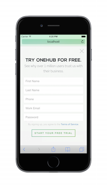
The impending new version of onehub.com will be our best attempt at device agnosticism yet. It is a mobile-first design that progressively enhances the layout, typography, page load, and features depending on your device, browser, and resolution. Everything you can see/do on a desktop computer, you can see/do from your phone. And this was achieved by building up from smaller devices, rather than stripping down from larger ones.
Has the pendulum gone too far in terms of any emphasis on designing for mobile?
No. I think anyone who browses the web on their phone, knows the answer to that question. There are still a lot of miniature, ugly, usability nightmares out there that are difficult to read/interact with.
What advice do you have for other designers wanting to incorporate a device agnostic approach?
To keep your designs both as accessible as possible and easy to maintain — you have to be willing to let go of aesthetics a bit. If you design something that looks amazing but can’t be scaled down and/or is too heavy to serve to a small device, the only options you will be left with are hiding parts of your content and/or degrading the experience. In the beginning, keep your focus on designing the experience of interacting with your content, rather than designing exactly how things will look. In the end, you will still have plenty of opportunity to add things that will delight people and/or improve the aesthetics.
You may also like