We recently shipped some updates to our breadcrumbs navigation. In this post, I’d like to walk you through the changes and discuss some of the design thinking behind the improvements.
Determining What was Most Important
When updating a frequently used piece of the interface, it is important to keep existing users in mind. One of the advantages of every Onehub employee, being Onehub users ourselves, is that it keeps all of us in touch with our users’ experience – allowing us to think through changes from an empathetic place. Armed with this empathy and some additional user research, our first step was to outline the most common user scenarios: breadcrumb navigation. To do this, we worked backwards from the following question:
“As a user, what is the most important function of the breadcrumbs?”
The immediate answer was being able to see the name of the folder/file you are currently looking at. Whether you’re looking at a file as a Viewer or Administrator, being reminded of which file you’re actually working with is a no-brainer.
A close second was the ability to quickly return to the root folder. Two of the most common actions taken in Onehub are one, quickly creating folders and uploading files; and two, hopping in to a file to add a comment/task, then hopping back up to the Workspace level to do something completely different.
Lastly, there are certainly times when you need to move through and collaborate on a handful of files at a time. In this scenario, being able to quickly jump back to the immediate parent folder and in to another file is important.
With these scenarios in mind, we set the following design goals for the redesign:
- Prioritize the current folder/file name.
- Always provide a link back to the root folder.
- Provide links to parent folders, exposing the immediate parent whenever possible.
Prioritizing the Current Folder/File Name
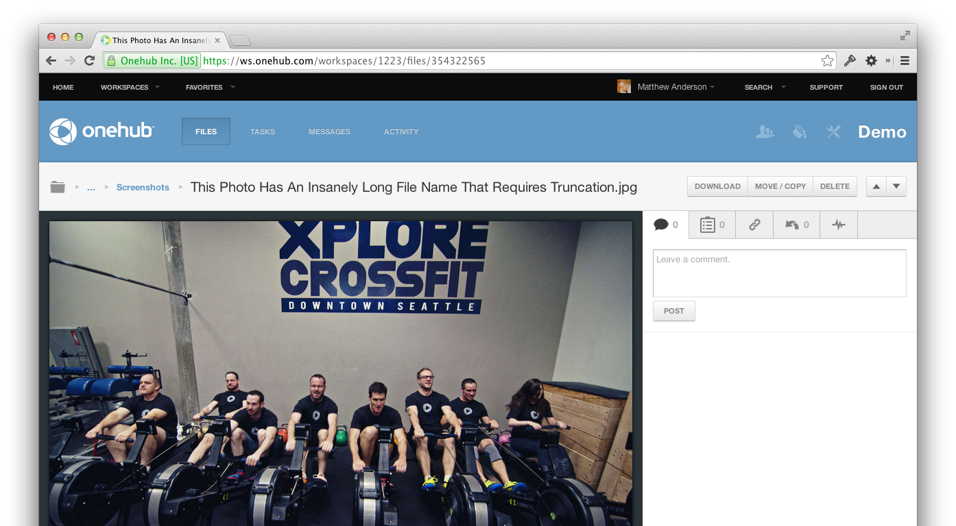
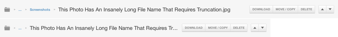
Now you always see as much of the name as we can possibly show you. If a folder/file name is too long to fit within the available space, we truncate it.
Maintaining Access to the Root Folder
With this redesign the root folder continues to always be present, allowing you to quickly jump back to the top-level of your folder tree at any time.

The “…” Crumb
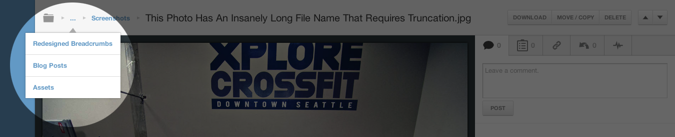
The final piece of the redesign is the new “more” crumb, signified by an ellipsis (…). This crumb fulfills the final design requirement dynamically. Depending on the available space around it, the more crumb may contain every parent folder or be non-existent. As space allows, we will pop folders out of the more crumb (starting with the closest parent) and display them inline with the current folder/file name.
I sincerely hope you find the redesigned breadcrumbs to be a wonderful enhancement. You can see them in action by visiting any of your Workspaces. As always, if you have any feedback, we’d love to hear it — tweet @onehub or send an email to support@onehub.com