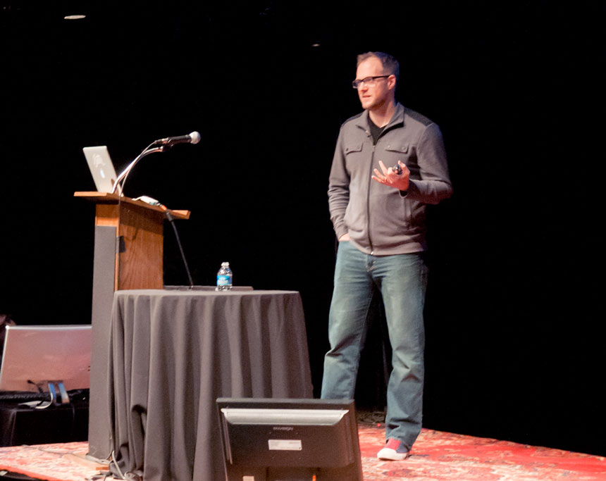
Meet Brian Warren – Onehub Designer and Typography Enthusiast
Each month we focus on helping you get to know the great people that work at Onehub. This month, we will be focusing on our lead designer, Brian and his passion for design and typography.

Q – How did you first realize that you were interested in design & typography?
A – I ended up here by way of a rather circuitous route. I went to college as a Theology major. After a few years, while deep in the fog of my second year of taking Greek, I realized I might be due for a change. I had always been into art, and was even doing design freelancing design in my spare time over the summers. Graphic design was an easy fit for me. I switched my major mid-semester and never looked back. (My rather average grades shot through the roof.)
I remember very clearly the first day of my first graphic design class. We were talking about typefaces and all the associated jargon and nuances of this strange discipline. I was hooked. I loved how detailed and logical type was, while also being elegant and beautiful. It nurtured both sides of my brain in a way that I hadn’t ever experienced before.
Q – What gets you excited about typography?
A – We’re currently experiencing a wonderfully exciting time in the world of typography. All modern web browsers, even on mobile devices, are capable of using web fonts. Prior to this era, designers on the web only had a handful of fonts at their disposal. Now it’s no exaggeration to say we have countless options for web typography. I feel like a kid in a candy store.
Q – Are there any drawbacks to having so many options for web type?
A – Of course. Just like being the kid in the candy store, if you eat all of the candy you’ll get sick. If a design incorporates too many web fonts, then the experience for a user loading the web page can be a little slow, especially for mobile users. It pays to be smart about which fonts you include, and in which weights and styles. I recently wrote about this particular topic for Typekit as a guest author on their blog: On Weights & Styles.
Q – What’s your favorite typeface?
A – I wish I could answer this. I can’t say I really have an all-time favorite. I do love Trade Gothic, and I confess I’ve always had a thing for Garamond.
Q – How are things looking for the future of web typography?
A – Type on the web has a bright future. We’ve jumped a few technical hurdles in getting web browsers to work with web fonts, and type foundries and distributors are making it easier than ever to buy and use web fonts. In the future, browser makers will be adding more features to allow us designers the flexibility that we have enjoyed in print design for centuries. Things like control over hyphenation, better kerning support, better ligature support, and stylistic alternates are all things that we can see are coming, but need more broad support by web browsers before we can rely on them.
Q – Do you have any suggestions for people who are interested in getting into typography?
A – Oh sure! For one, everybody interested in typography needs a well-worn copy of this on their shelf: The Elements of Typographic Style, by Robert Bringhurst. This is the first stop on the typographic train. Bringhurst eloquently explains both the how and why behind everything from font selection to page dimensions with a passion that is absolutely contagious.
There’s no shortage of websites to read about typography as well. One of my favorites is Typedia, a user-contributed encyclopedia of typefaces. In addition to being a fantastic resource on its own, Typedia hosts a weekly Type News article written by my friends Grant Hutchinson and Erik Vorhes. It has tons of info each week including new typeface releases, typographic news, and links to great type articles around the web.
Q – How can those interested keep up with your latest and greatest in the world of design and typography?
A – Well, I write semi-regularly on my site at Be Good Not Bad, and I am @mrwarren on Twitter. If you happen to be near Vancouver, you can see me speak at Web Type West on February 1, 2014.